티스토리 뷰
1. Css 우선순위
1) 동일한 속성을 적용할 경우 나중에 적용한 것이 우선
2) 외부 스타일 시트와 내부 스타일 시트의 적용은 순서에 따라 나중에 적용한 것이 우선
3) 내부, 외부, 인라인 스타일 시트 중 인라인을 우선시 적용되면
4) 우선순위 계산
- inline: 1000점
- id: 100점
- class, 속성 선택자: 10점
- element: 1점
5) !important를 적용하면 0순위
ex)
<head>
<style>
...
</style>
<link> ... </link> -> link가 style 태그를 덮어씌움
</head>
( style.css )
div {
    background-color: purple;
}
( Html )
<html lang="en">
<head>
    <title>CSS 우선순위</title>
    <style>
        #id-style { background-color: deeppink; }
        #id-style2 { background-color: deepskyblue; }
        div {
            display: block;
            padding: 30px;
            margin: 30px;
            background-color: gold;
        }
        .class-style3 {
            background-color: beige !important;
        }
        .class-style {
            background-color: greenyellow;
        }
        .class-style2 {
            background-color: pink;
            font-size: 25px;
        }
        ul > li.li-class {
            background-color: orange;
        }
        ul > li {
            background-color: violet;
        }
    </style>
    <link rel="stylesheet" href="./css/style.css">
</head>
<body>
    <h2>CSS 우선순위</h2>
    <div style="background-color: aqua;">div 1번</div>  <!-- 내부스타일 우선: aqua -->
    <div id="id-style" class="class-style">div 2번</div>  <!-- id 100점 우선: deeppink-->
    <div class="class-style">div 3번</div>               <!-- class 우선: greenyellow -->
    <div class="class-style2 class-style">div 4번</div>  <!-- class style2가 나중에 적용: pink -->
    <div>div 5번</div>                                 <!-- link가 덮어씌움: purple-->
    <ul>
        <li class="li-class">li 1번</li>               <!-- class > element: orange -->
    </ul>
    <div id="id-style2" class="class-style3">div 6번</div> <!-- important 우선: beige -->
</body>
</html>
2. Css 변수
- CSS Custom Properties
CSS의 속성 값을 재사용하고 동적으로 변경할 수 있게 해주는 기능
정의
:root {
--main-color: ##FF0000;
--font-size: 15px;
}
<html lang="en">
<head>
    <title>css 변수</title>
    <style>
        :root {
            --background-color: deepskyblue;
            --text-color: white;
        }

        .first-list {
            background-color: var(--background-color);
            color: var(--text-color);
        }

        .second-list {
            background-color: var(--background-color);
            color: var(--text-color);
        }
        @media screen and (max-width: 768px) {
            :root {
                --background-color: darkslateblue;
                --text-color: ivroy;
            }
        }
    </style>
</head>
<body>
    <h2>css 변수</h2>
    <ul class="first-list">
        <li>김사과</li>
        <li>반하나</li>
    </ul>

    <ul class="second-list">
        <li>오렌지</li>
        <li>이메론</li>
        <li>배애리</li>
    </ul>
</body>
</html>
3. 카페 소개 웹 만들기
( 카페 소개.css )
@font-face {
    font-family: 'KCC-Hanbit';
    src: url('https://cdn.jsdelivr.net/gh/projectnoonnu/2403-2@1.0/KCC-Hanbit.woff2') format('woff2');
    font-weight: normal;
    font-style: normal;
}

body {font-family: 'KCC-Hanbit';}

#container {
    width: 100%;
    margin: 0 auto;
}

nav {
    height: 50px;
    background-color: black;
}

nav > ul {
    list-style: none;
    margin: 0;
    padding: 3px;
}

nav > ul > li {
    display: inline-block;
    margin: 15px 20px
}

a {text-decoration: none;}
a:link, a:visited {color: white;}
a:active, a:hover {color: yellow;}

header {
    width: 100%;
    height: 300px;
    background-image: url(./images/header.jpg);
    background-repeat: no-repeat;
    background-position: center;
    background-size: cover;
    margin: 0;
}

.photo {display: none;}

section {
    position: relative;
    width: 100%;
    padding: 15px 5%;
}

.page-title {
    position: absolute;
    top: 20px;
    left: 0px;
    padding: 30px 50px;
}

.content {
    margin: 80px auto 10px;
    width: 90%;
    padding: 20px;
    box-sizing: border-box;
}

#container section:nth-child(even) {
    background-color: beige;
}

footer {
    position: relative;
    width: 100%;
    height: 100px;
    background-color: black;
}

footer > p {
    color: white;
    text-align: center;
    line-height: 100px;
}

/* 태블릿 버전 */
@media screen and (min-width: 768px){
    header {height: 400px;}

    #intro, #map {
        box-sizing: border-box;
        width: 50%;
        float: left;
        margin: 0;
        height: 300px;
    }

    #choice{
        clear: both;
    }
}

/* PC 버전 */
@media screen and (min-width: 1024px) {
    #container {
        width: 1000px;
        margin: 0 auto;
    }

    header{height: 450px;}

    #intro, #map, #choice{
        box-sizing: border-box;
        position: relative;
        width: 100%;
        height: 400px;
        padding: 15px 5%;
    }

    .photo {
        display: block;
        width: 40%;
        margin-top: 20px;
    }

    .content {
        margin: 80px auto 10px;
        width: 90%;
        padding: 20px;
    }

    .photo > img {
        width: 100%;
        max-width: 320px;
        height: auto;
        margin-bottom: 30px;
    }

    #intro .photo, #map .photo {
        float: left;
        margin-right: 5%;
    }

    #choice .photo{
        float: right;
    }

    .text {width: 45%;}

    #intro .text, #map .text {float: right;}

    #choice .text {float: left;}

    #choice .photo img {border: 1px solid white; border-radius: 50%;}

    footer {clear: both;}

}
( 카페소개.html )
<html lang="en">
<head>
    <title>카페 소개</title>
    <link rel="stylesheet" href="./3_카페소개.css">
</head>
<body>
    <div id="container">
        <header>
            <nav>
                <ul>
                    <li><a href="#intro">카페소개</a></li>
                    <li><a href="#map">오시는 길</a></li>
                    <li><a href="#choice">이달의 추천</a></li>
                </ul>
            </nav>
        </header>
        <section id='intro'>
            <div class="page-title">
                <h2>카페 소개</h2>
            </div>
            <div class="content">
                <div class="photo"><img src="./images/coffee.jpg" alt="커피"></div>
                <div class="text">
                    <p>영업 시간 : 오전 9시 ~ 밤 10시</p>
                    <p>휴무 : 매주 수요일 <i><small>(수요일이 공휴일인 경우 수요일 영업, 다음날 휴무)</small></i></p>
                </div>
            </div>
        </section>

        <section id='map'>
            <div class="page-title">
                <h2>오시는 길</h2>
            </div>
            <div class="content">
                <div class="photo"><img src="./images/map.jpg" alt="지도"></div>
                <div class="text">
                    <p>서귀포시 안덕면 사계리 000-000</p>
                    <p>제주 올레 10코스 산방산 근처</p>
                </div>
            </div>
        </section>

        <section id='choice'>
            <div class="page-title">
                <h2>이달의 추천</h2>
            </div>
            <div class="content">
                <div class="photo"><img src="./images/ice.jpg" alt="추천"></div>
                <div class="text">
                    <h2>핸드드립 아이스 커피</h2>
                    <ol>
                        <li>1인분 기준으로 서버에 각 얼음 5조각(한조각은 20cc) 넣고 추출을 시작한다.</li>
                        <li>평상시 보다 원두의 양은 2배정도(20g)와 추출액은 얼음 포함해서 200cc까지 내린다.</li>
                        <li>아이스 잔에 얼음 6~7개를 섞어서 시원하게 마신다.</li>
                    </ol>
                </div>
            </div>
        </section>
        <footer>
            <p>My times with Coffee</p>
        </footer>
    </div>
</body>
</html>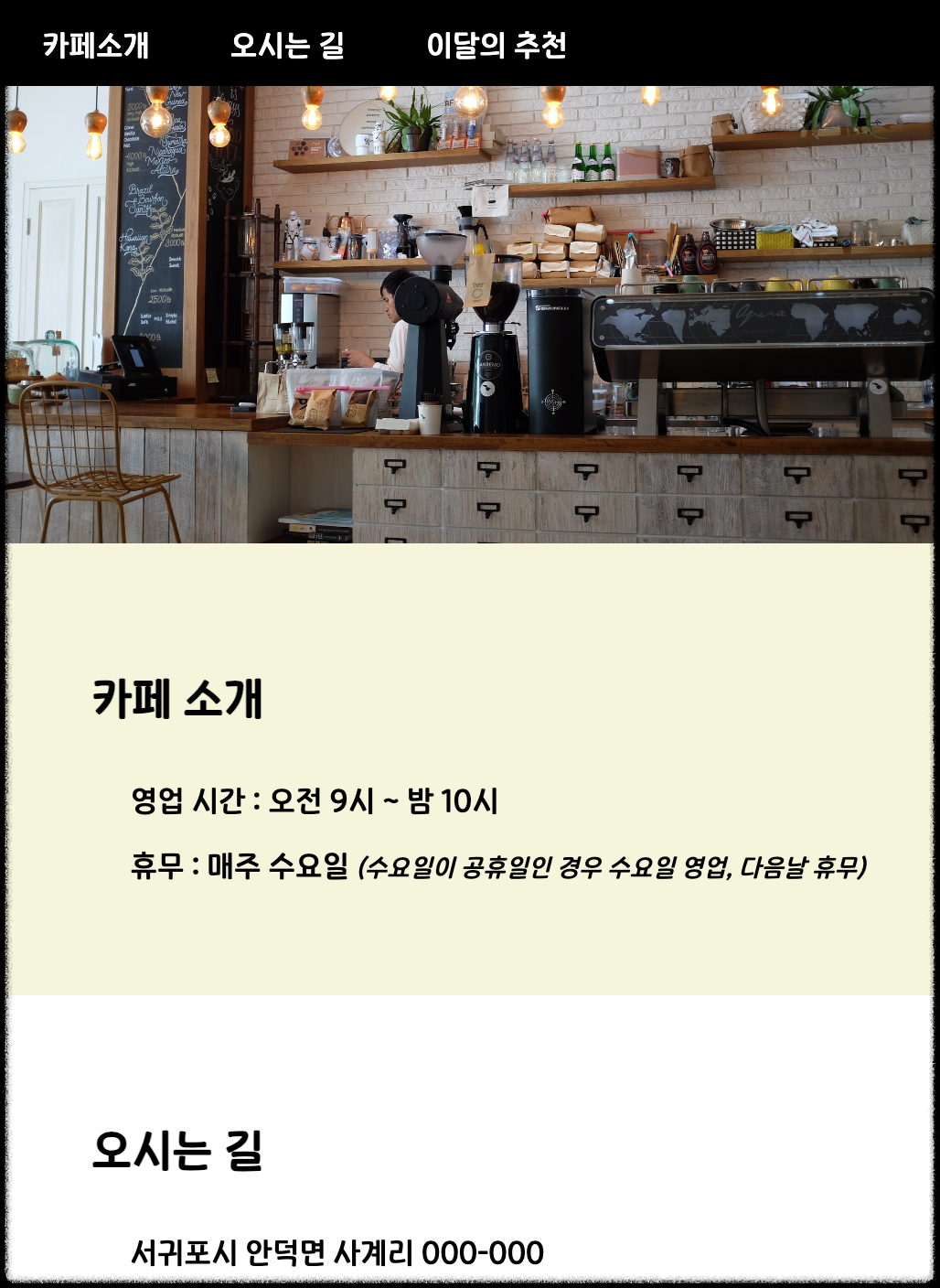

4. transform
- 2차원 좌표에서 요소를 변형시키는 속성
translate, rotate, scale, skew
벤더 프리픽스 (Vender Prefix)
- 주요 웹 브라우저 공급자가 새로운 실험적인 기능을 제공할 때 이전 버전의 웹 브라우저에 그 사실을 알리기 위해 사용하는 접두사
- w3c css 권고안에 포함되지 않은 기능이나, 포함되어 있지만 아직 완벽하게 제정된 상태가 아닌 기능을 사용할 때 붙임
- webkit- : 크롬, 엣지를 위한 접두사
- o - : 오페라를 위한 접두사
- ms - : 익스플로러를 위한 접두사
- moz - : 파이어폭스를 위한 접두사
- 해당 속성이 적용되지 않았을 경우 표현해야 할 코드를 가장 먼저 작성해야 하며, 표준 문법코드는 가장 마지막에 작성해야 함
<html lang="en">
<head>
    <title>transform</title>
    <style>
        p {
            width: 600px;
            padding: 20px;
            border: 3px solid rgba(0, 0, 0, 0.5);
        }
        #translate {
            transform: translate(30px, 50px); /*가로 30px, 세로 50px 이동 */
            background-color: antiquewhite;
        }
        #rotate {
            transform: rotate(60deg);       /* 60도를 돌림 */
            background-color: lightblue;
        }
        #scale {
            transform: scale(1.5, 1.2);   /* x축으로 1.5배, y축으로 1.2배 커짐 */
            background-color: lightcoral;
        }
        #skew {
            transform: skew(30deg, 15deg);  /* x축의 기울기 각도, y축 기울기 각도 */
            background-color: lightgreen;
        }
        #gradient {
            background: pink;
            /* 크롬, 엣지를 위한 코드 */
            background: -webkit-linear-gradient(left, pink, gray);
            /* 오페라를 위한 코드 */
            background: -o-linear-gradient(left, pink, gray);
            /* 익스플로러를 위한 코드 */
            background: -ms-linear-gradient(left, pink, gray);
            /* 파이어폭스를 위한 코드 */
            background: -moz-linear-gradient(left, pink, gray);
            /* CSS 표준 문법 코드 */
            background: -webkit-linear-gradient(left, pink, gray);
        }
    </style>
</head>
<body>
    <h2>transform</h2>
    <p>original</p>
    <p id="translate">translate</p>
    <p id="rotate">rotate</p>
    <p id="scale">scale</p>
    <p id="skew">skew</p>
    <p id="gradient">gradient</p>
</body>
</html>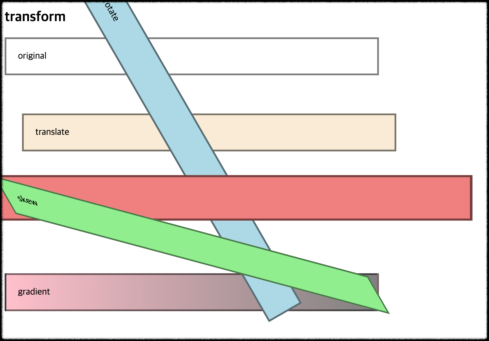
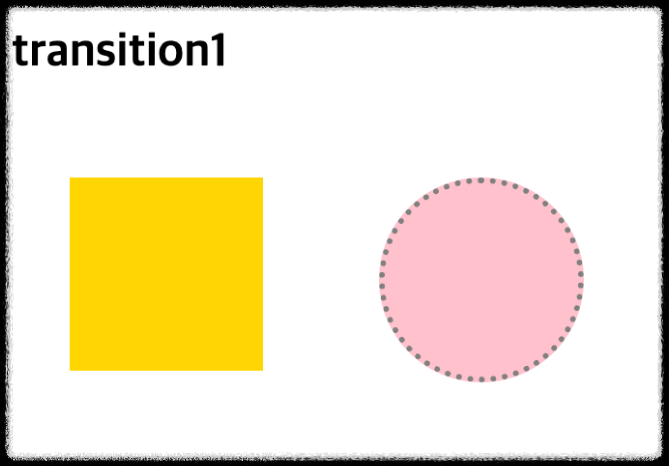
5. transition 1
- 요소에 추가할 css 스타일 전환효과를 설정
- 추가할 전환효과나 지속시간도 설정
property: 요소에 추가할 전환효과를 설정
timing-function: 전환효과의 값을 설정
linear: 처음부터 끝까지 일정한 속도
ease: 전환효과가 천천히 -> 빨라지고 -> 천천히 -> 끝
duration: 전환효과를 나타내는 시간을 설정
delay: 설정한 시간만큼 대기하다 전환효과를 나타냄
<html lang="en">
<head>
    <title>transition1</title>
    <style>
        div {
            width: 100px;
            height: 100px;
            float: left;
            margin: 30px;
        }
        #bg-tr {
            background-color: gold;
            transition: background-color ease 2s;
        }
        #bg-tr:hover {
            background-color: red;
        }
        #border-tr {
            background-color: darkgreen;
            border: 3px dotted yellow;
            transition: all linear 2s;
        }
        #border-tr:hover {
            background-color: pink;
            border: 3px dotted gray;
            border-radius: 50%;
        }
    </style>
</head>
<body>
    <h2>transition1</h2>
    <div id="bg-tr"></div>
    <div id="border-tr"></div>
</body>
</html>

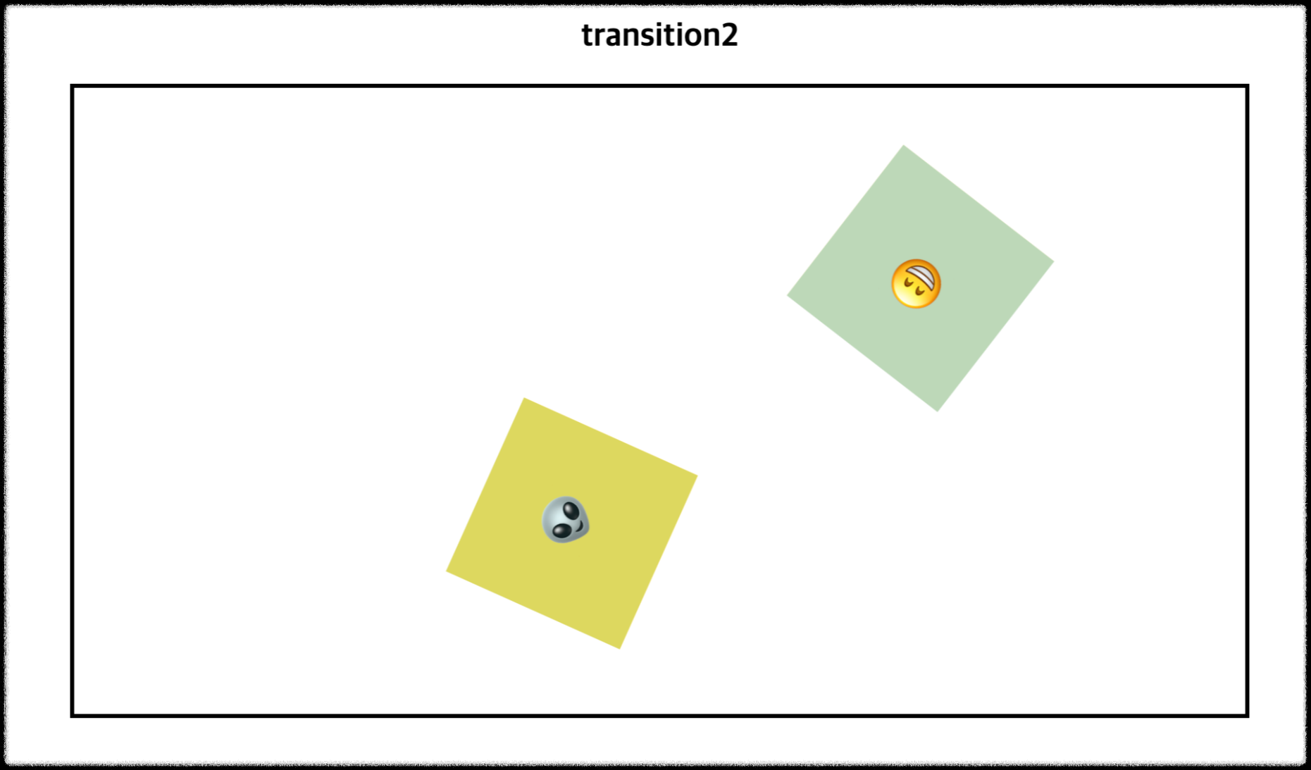
6. transition 2
<html lang="en">
<head>
    <title>transition2</title>
    <style>
        h2 {
            text-align: center;
            margin-top: 30px;
        }
        #ex {
            position: relative;
            width: 800px;
            height: 400px;
            border: 3px solid black;
            padding: 30px;
            margin: 0px auto;
        }

        #ex:hover > .box {
            transform: rotate(720deg);
            margin-left: 650px;
            background-color: lightblue;
        }

        #no-delay {
            transition-duration: 3s;
        }

        #delay {
            transition-delay: 1s;
            transition-duration: 2s;
        }

        p {
            font-size: 40px;
            text-align: center;
            padding-top: 40px;
        }
        .box {
            font-size: 20px;
            position: relative;
            width: 140px;
            height: 140px;
            margin-bottom: 20px;
            background-color: gold;
        }

    </style>
</head>
<body>
    <h2>transition2</h2>
    <div id="ex">
        <div id="no-delay" class="box">
            <p>😁</p>
        </div>
        <div id="delay" class="box">
            <p>👽</p>
        </div>
    </div>
</body>
</html>


7. animation
- 요소의 현재 스타일을 다른 스타일로 변환
@keyframe
시작: 0%, from
과정: 1%, 3%, 10%, ...
끝: 100%, to
0% 5% 10% ... 100%
장면1 장면2 장면3 ... 끝장면
1) animation-name: 애니메이션 이름을 설정
2) animation-fill-mode: 애니메이션이 끝난 후 어떻게 처리할지 설정
- forwards: 애니메이션 키프레임이 완료 되었을 때 마지막 프레임으로 유지
3) animation-direction: 애니메이션의 진행 방향을 정하는 속성
- normal : 정상 방향으로 진행
- reverse: 반대 순서로 진행
- alternate: 정해진 순서로 진행했다가 다시 반대로 순서로 진행
- reverse-alternate: 반대 순서로 진행했다가 다시 정해진 순서로 진행
4) animation-duration: 애니메이션이 일어나는 시간을 설정
5) animation-iteration-count: 애니메이션이 몇 번 반복할지 설정
- infinite: 무한반복
- 숫자: 숫자만큼 반복
<html lang="en">
<head>
    <title>animation1</title>
    <style>
        .box {
            margin-top: 100px;
            margin-left: 100px;
            padding: 20px;
            height: 60px;
            animation-name: moving;
            animation-duration: 3s;
            animation-iteration-count: infinite;
            animation-direction: alternate;
        }

        @keyframes moving {
            from {
                width: 200px;
                background-color: gold;
                opacity: 0.5;    /* 불투명도 */
                transform: rotate(0deg);
            }
            to {
                width: 400px;
                background-color: pink;
                opacity: 1;
                transform: rotate(360deg);
            }
        }
    </style>
</head>
<body>
    <h2>animation1</h2>
    <div class="box">
        <h3>CSS3 Animation</h3>
    </div>
</body>
</html>


'Web' 카테고리의 다른 글
| 14. JavaScript 출력, 변수, 상수, 데이터타입, 타입변환, 대화상자, if문, switch문 (0) | 2024.05.13 |
|---|---|
| 13. (과제) 내 홈페이지에 animation 적용하기 (0) | 2024.05.12 |
| 11. Html Css 미디어 쿼리 (0) | 2024.04.12 |
| 10. Html Css 레이아웃 (z-index, float, clear, n단 레이아웃) (1) | 2024.04.12 |
| 9. Html Css 위치 지정방식 (0) | 2024.04.11 |
- Total
- Today
- Yesterday
- 파이썬SQL연동
- trasform
- 박스사이징
- HTML
- 변수
- CSS
- DB프로그램만들기
- 상대위치
- 클래스문
- 절대위치
- 셋
- FOR
- 닷홈
- DB단어장
- 줄 간격
- 폼
- Enclosing
- 솔로의식탁
- EPL정보프로그램
- 고정위치
- 리스트
- 로또번호생성
- 출력
- MySQLdb
- Python
- __call__
- html이론
- animation적용
- JavaScript
- MySQL
| 일 | 월 | 화 | 수 | 목 | 금 | 토 |
|---|---|---|---|---|---|---|
| 1 | 2 | 3 | 4 | 5 | 6 | 7 |
| 8 | 9 | 10 | 11 | 12 | 13 | 14 |
| 15 | 16 | 17 | 18 | 19 | 20 | 21 |
| 22 | 23 | 24 | 25 | 26 | 27 | 28 |
| 29 | 30 |