티스토리 뷰
1. 미디어 쿼리 1
<html lang="en">
<head>
    <title>미디어쿼리1</title>
    <style>
        body {background-color: lightcyan;}

        @media screen and (min-width: 800px){    /* 넓이가 최소 800px이 되면 */
            body {background-color: lightcoral;}
        }
    </style>
</head>
<body>
    <h2>미디어쿼리1</h2>
</body>
</html>
2. 미디어쿼리2
( 미디어쿼리2.css )
* {
    margin: 0;
    padding: 0;
    box-sizing: border-box;
}

header {
    width: 100%;
    background-color: black;
    margin-bottom: 20px;
}

nav > ul {
    height: 50px;
    list-style: none;
    color: gold;
}

nav > ul > li {
    float: left;
    padding: 10px;
    margin: 5px 5px;
    font-size: 12px;
}
/*  구형폰: 320px
    일반폰: 360px
*/

nav, #contents {
    width: 320px;
    margin: 0 auto;
}

#intro > img {
    width: 100%;
    padding: 10px;
}

#desc {
    width: 100%;
    padding: 10px;
    line-height: 1.5;
}

footer {
    width: 100%;
    height: 50px;
    padding: 10px;
    background-color: black;
    color: white;
}

footer > p {
    text-align: center;
    font-size: 16px;
    line-height: 25px;
}

/* 태블릿: 768px ~ */
@media screen and (min-width: 768px) {
    nav > ul {
        height: 80px;
    }
    nav > ul > li {
        margin: 20px 40px;
        font-size: 20px;
    }
    nav, #contents {
        width: 750px;
        margin: 0 auto;
    }
    #intro {
        width: 100%;
    }
    #intro > img {
        width: 22%;
        padding: 10px;
    }

    #desc {
        width: 100%;
        padding: 10px;
        margin: 10px auto;
    }

    footer {
        height: 70px;
        padding: 10px;
    }

    footer > p {
        font-size: 20px;
        line-height: 50px;
    }
}

/* 데스크탑 : 1024px */
@media screen and (min-width: 1024px) {
    nav, #contents {
        width: 1000px;
        margin: 0 auto;
    }

    nav > ul > li {
        margin: 20px 13px;
        font-size: 20px;
    }

    #intro > img {
        width: 10%;
        padding: 10px;
        float: left;
        margin-right: 20px;
    }

    footer{
        clear: both;
    }
}
( 미디어쿼리2.html )
<html lang="en">
<head>
<title>미디어쿼리2</title>
<link rel="stylesheet" href="./12_미디어쿼리2.css">
</head>
<body>
<div id="container">
<header>
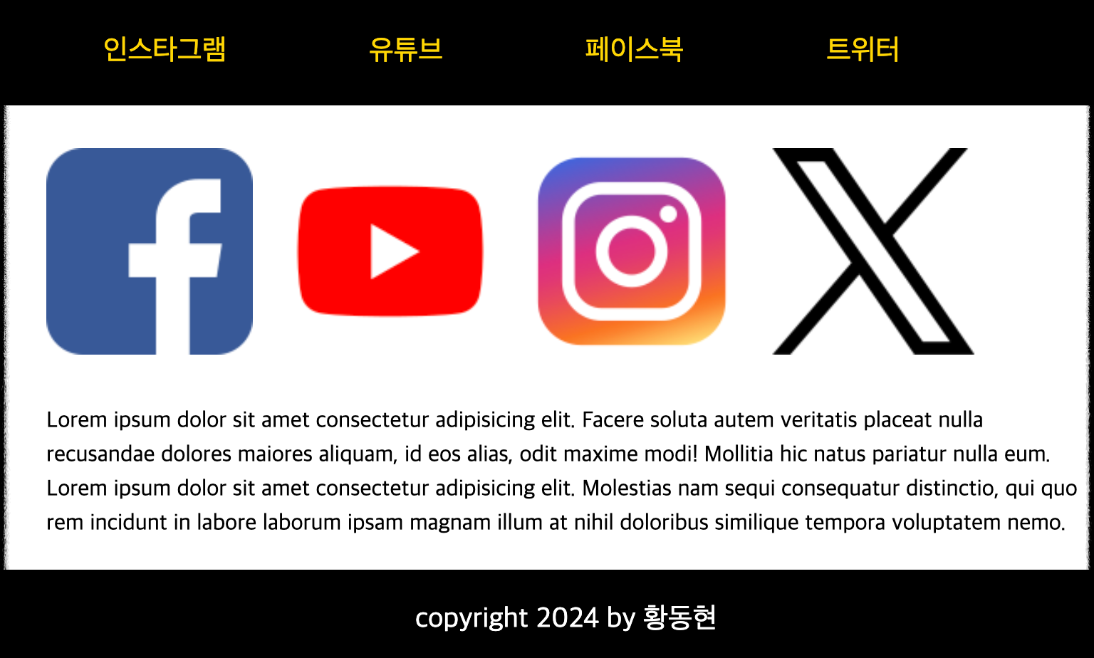
<nav>
<ul>
<li>인스타그램</li>
<li>유튜브</li>
<li>페이스북</li>
<li>트위터</li>
</ul>
</nav>
</header>
<div id="contents">
<section id="intro">
<img src="./images/페이스북.png" alt="페이스북">
<img src="./images/유튜브.png" alt="유튜브">
<img src="./images/인스타그램.png" alt="인스타그램">
<img src="./images/트위터.png" alt="트위터">
</section>
<section id="desc" class="text">
<p>Lorem ipsum dolor sit amet consectetur adipisicing elit. Facere soluta autem veritatis placeat nulla recusandae dolores maiores aliquam, id eos alias, odit maxime modi! Mollitia hic natus pariatur nulla eum. Lorem ipsum dolor sit amet consectetur adipisicing elit. Molestias nam sequi consequatur distinctio, qui quo rem incidunt in labore laborum ipsam magnam illum at nihil doloribus similique tempora voluptatem nemo.</p>
</section>
</div>
<footer>
<p>copyright 2024 by 황동현</p>
</footer>
</div>
</body>
</html>

3. 반응형 웹 실습
( 13_솔로의식탁.css )
#container {
    width: 100%;
}

header {
    width: 100%;
}

header > h1 {
    text-align: center;
    font-size: 3em;
}

#menus {
    width: 100%;
}

#menus > div {
    height: 400px;
    border: 1px solid black;
    margin-bottom: 15px;
    position: relative;
}

#menus h2 {
    position: absolute;
    right: 3%;
    bottom: 10px;
    font-size: 2em;
    color: white;
    text-shadow: 3px 3px 5px black;
}

#menu1, #menu2, #menu3, #menu4, #menu5 {
    width: 100%;
}

#menu1 {
    background: url(./images/dish1.jpg) no-repeat center/cover;
}

#menu2 {
    background: url(./images/dish2.jpg) no-repeat center/cover;
}

#menu3 {
    background: url(./images/dish3.jpg) no-repeat center/cover;
}

#menu4 {
    background: url(./images/dish4.jpg) no-repeat center/cover;
}

#menu5 {
    background: url(./images/dish5.jpg) no-repeat center/cover;
}

footer {
    width: 100%;
    background-color: black;
    height: 100px;
}

footer > p {
    font-size: 1.5em;
    color: white;
    text-align: center;
    line-height: 100px;
}

@media screen and (min-width: 768px) {
    #menus {
        display: flex;
        flex-wrap: wrap;
        justify-content: space-between;
    }

    #menu1, #menu2, #menu3, #menu4 {
        width: 49%;
    }
}


@media screen and (min-width: 1024px) {
    #menu1, #menu2, #menu3, #menu4 {
        width: 32%;
    }

    #menu5 {
        width: 66%;
    }
}
( 13_솔로의식탁.html )
<html lang="en">
<head>
    <title>솔로의 식탁</title>
    <link rel="stylesheet" href="./13_솔로의식탁.css">
</head>
<body>
    <div id="container">
        <header>
            <h1>솔로의 식탁</h1>
        </header>
        <section id="menus">
            <div id="menu1">
                <h2>밥/죽</h2>
            </div>

            <div id="menu2">
                <h2>샐러드</h2>
            </div>

            <div id="menu3">
                <h2>반찬</h2>
            </div>

            <div id="menu4">
                <h2>토스트</h2>
            </div>

            <div id="menu5">
                <h2>음료</h2>
            </div>
        </section>
        <footer>
            <p>솔로의 식탁</p>
        </footer>
    </div>
</body>
</html>


'Web' 카테고리의 다른 글
| 13. (과제) 내 홈페이지에 animation 적용하기 (0) | 2024.05.12 |
|---|---|
| 12. Html Css 우선순위, 변수, transform, animation (0) | 2024.04.12 |
| 10. Html Css 레이아웃 (z-index, float, clear, n단 레이아웃) (1) | 2024.04.12 |
| 9. Html Css 위치 지정방식 (0) | 2024.04.11 |
| 8. Html Css 폼 꾸미기 (패딩, 테두리, 마진, 박스사이징, 디스플레이) (1) | 2024.04.11 |
공지사항
최근에 올라온 글
최근에 달린 댓글
- Total
- Today
- Yesterday
링크
TAG
- __call__
- MySQLdb
- 박스사이징
- DB프로그램만들기
- 폼
- 절대위치
- 고정위치
- trasform
- 줄 간격
- CSS
- 출력
- DB단어장
- 셋
- 리스트
- FOR
- EPL정보프로그램
- MySQL
- 솔로의식탁
- animation적용
- JavaScript
- 파이썬SQL연동
- HTML
- Python
- 변수
- 닷홈
- html이론
- 상대위치
- 로또번호생성
- 클래스문
- Enclosing
| 일 | 월 | 화 | 수 | 목 | 금 | 토 |
|---|---|---|---|---|---|---|
| 1 | 2 | 3 | 4 | 5 | 6 | 7 |
| 8 | 9 | 10 | 11 | 12 | 13 | 14 |
| 15 | 16 | 17 | 18 | 19 | 20 | 21 |
| 22 | 23 | 24 | 25 | 26 | 27 | 28 |
| 29 | 30 |
글 보관함